Tactile Equipment Labels: Separate Raised Information From Flat Print
Published
The artwork contains a neat dot pattern and the buyer has written tactile label on the request. On screen, everything is present. A person expected to read the label through touch has not yet been given anything they can evaluate.
Define the touch-reading task before ordering the format. Flat printed information, raised characters, simple tactile markers and Braille are different deliverables. Ask the supplier to confirm the proposed manufacturing capability, and arrange appropriate content and physical review. A visual proof can support the discussion; it cannot establish touch readability.
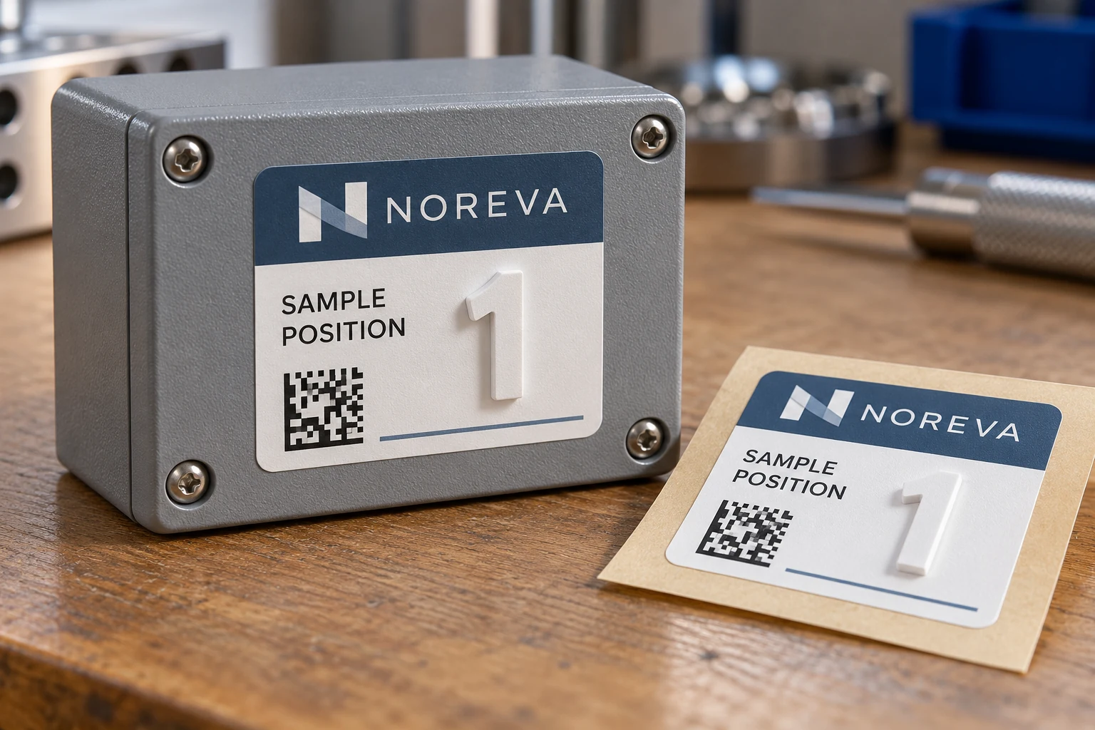
Specify what the reader needs to distinguish
Begin with the task rather than a decorative treatment. Is the user locating a known position, distinguishing two similar items, reading a short identifier or receiving a complete instruction? Is the information intended for a particular trained user or a broader audience? Those distinctions affect the content, review and physical format needed.
Consider an illustrative request for a raised position marker on a demonstration panel. A simple agreed marker might distinguish one location from another for a known workflow. It does not automatically communicate the same information as a written word, and it should not be presented as Braille merely because someone can feel it.
For equipment controls, retain the owner-approved function and position mapping. Adding a touch channel does not authorize changing what a control does or how it is described. The button-legend guide addresses that mapping; the additional question here is how the intended person can receive the information physically.
Record whether access involves bare fingers, gloves or another condition relevant to the actual task. Do not assume a design reviewed in one condition will work in every other condition. Have the responsible equipment and accessibility reviewers determine the suitable way to evaluate it without introducing unsafe equipment interaction.
A dot picture is not raised information
RNIB's explanation of Braille equipment describes physical methods such as embossing dots into material. Its examples make the distinction concrete: representing dots in ordinary ink is not the same output as producing a tactile reading surface. This is background on the medium, not a specification for an industrial label.
If Braille is required, give the task to an appropriate content resource rather than converting letters into a decorative dot font. The relevant language, code and intended use need a qualified review. Do not infer that a correctly spelled visible word establishes correct Braille content, or that a visual inspection establishes suitable physical dots.
Similarly, a raised numeral can be a proposed raised-character format without being Braille. A tactile locator can help identify a position without containing a readable word. State exactly which format is being requested and what it is expected to communicate.
Keep content review separate from physical review
Purchasing needs a handoff that exposes who approves each part of the job. One attractive mockup should not become the evidence for every decision.
| Decision | Responsible review | Useful deliverable |
|---|---|---|
| Intended task | User, equipment and accessibility owners as appropriate | What must be found or understood |
| Words and meaning | Authorized content owner | Approved text and position map |
| Braille, if required | Appropriate qualified content reviewer | Approved transcription and applicable specification |
| Physical format | Supplier capability and technical review | Defined raised, embossed or other proposed construction |
| Use evaluation | Appropriate users and responsible reviewers | Observations on representative physical samples |
| Application | Equipment owner and supplier | Placement, surface and exposure review |
This is a proposed responsibility table. It is not a legal compliance checklist, certification scheme or substitute for a specialist specification. Where a particular standard or requirement applies, the responsible reviewer must establish its scope and acceptance criteria for the actual installation.
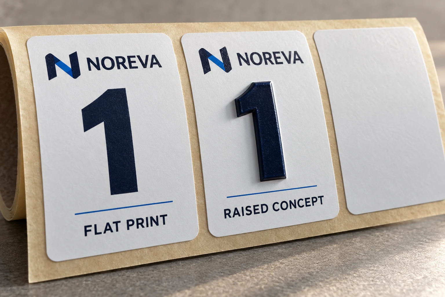
A physical sample should represent the relevant content and construction at the intended size. Have the reviewer assess the actual task, including locating the information and distinguishing it in its installed context. Keep the observation specific to what was evaluated. A proposed review is not a claim that CYJ has conducted a user trial.
Attachment and exposure still matter. Describe the surface, repeated contact, cleaning process and intended replacement arrangement. A format that can be felt initially may still need separate evaluation for its service conditions. Do not convert a promising first impression into an unsupported lifetime claim.
Compare a simpler or specialist option
If the actual problem is visual contrast, a clearer conventional printed label may address it without adding raised elements. That choice is useful only when it meets the intended reader's need; it cannot solve a requirement to read by touch simply by using larger type.
For a small internal project, a suitable specialist tactile-label solution may be more practical than commissioning a custom construction. For another application, separate visual and tactile resources may work better than forcing both into one footprint. Let the responsible reviewers decide whether either option satisfies the actual task and applicable requirements.
Do not treat building-sign rules as a universal recipe for equipment stickers. Standards are tied to their scope and installation. Obtain the relevant advice for the equipment and location instead of borrowing a convenient dot height or spacing value from an unrelated example.
Ask about capability before approving artwork
Send a functional brief first. A supplier should be able to say which part it can make, which requires another process or specialist, and what evidence is needed before an order can be accepted. This article does not confirm that CYJ currently supplies embossed, raised or Braille constructions.
For a custom industrial label discussion, prepare a tactile-format feasibility brief with the intended task, approved wording, any specialist transcription, placement photos, dimensions, touch conditions, cleaning exposure, quantities and proposed review responsibility. Organize it on the contact page and send supporting files through email or WhatsApp. Settle what the user must receive before deciding what the print file should look like.